abcd
Microsoft’s Lumia 950 was bland, uninspired, plasticky, and looked like any other low-end Lumia that Microsoft has been churning out over the past year. The problem was that it wasn’t low-end Lumia, and for its $650 price tag we expected a lot more. Microsoft might not be putting a lot of design effort into its flagship Windows 10 phones, but it’s certainly paying some attention to its latest budget Lumia.
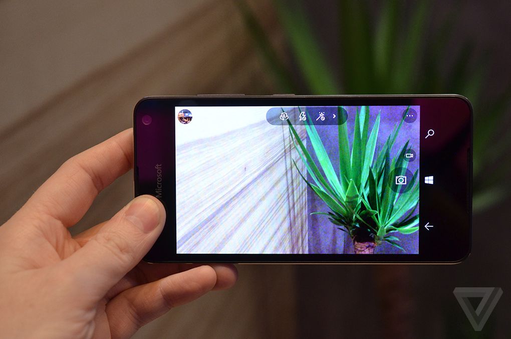
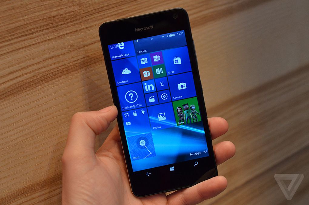
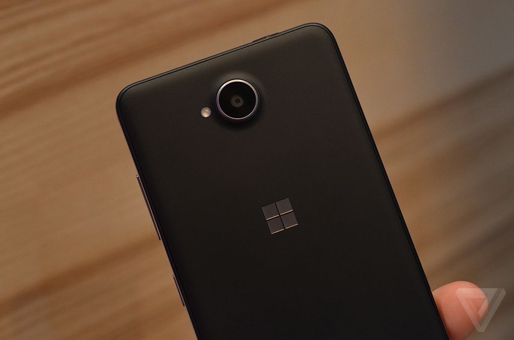
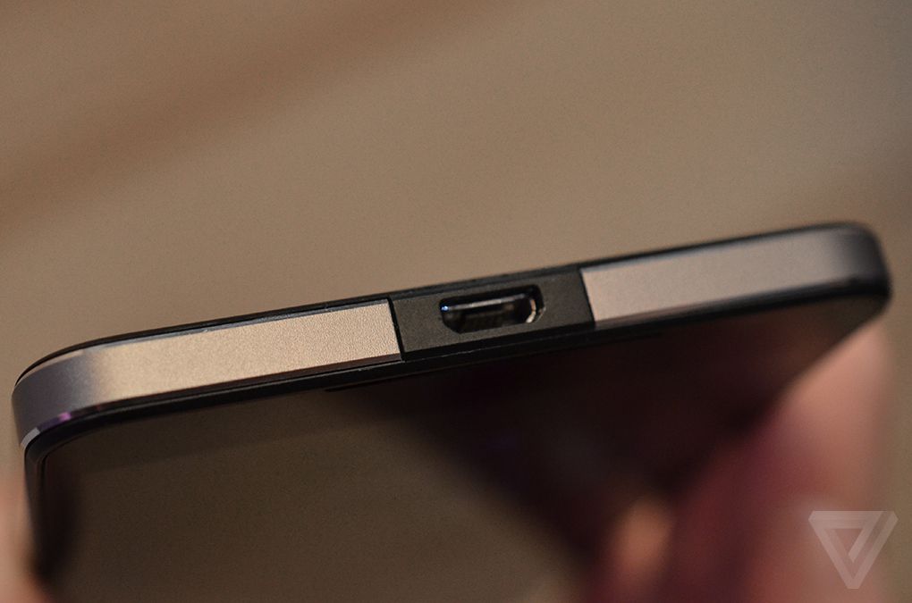
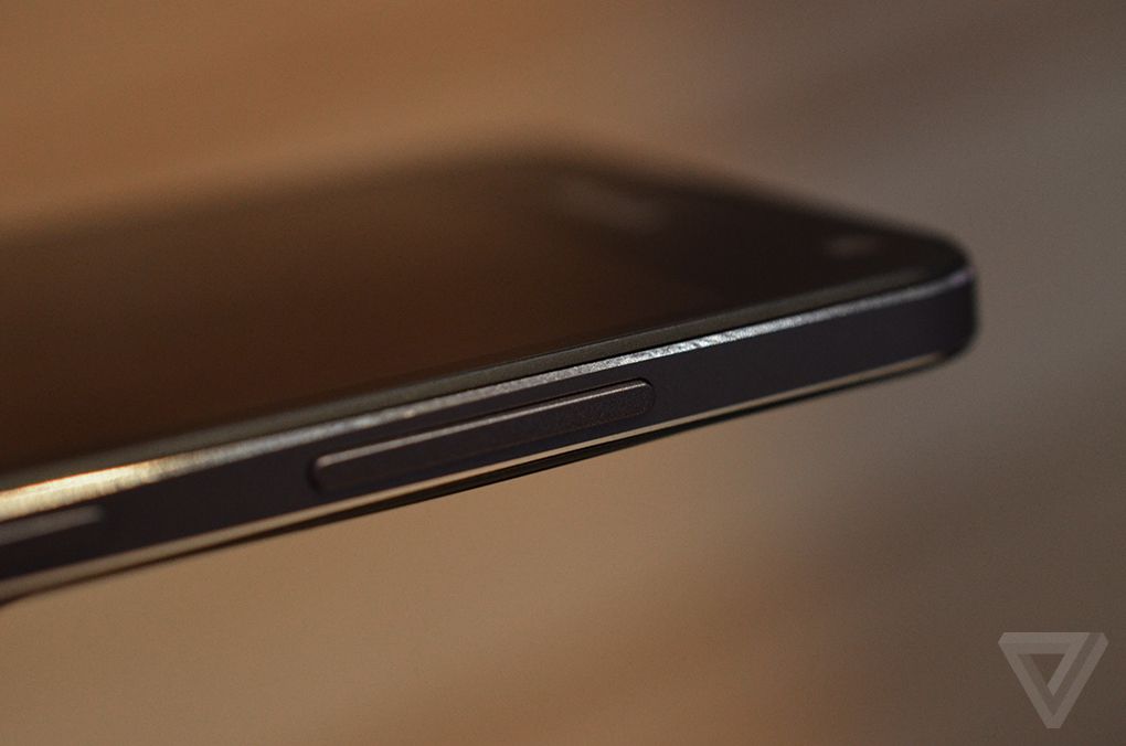
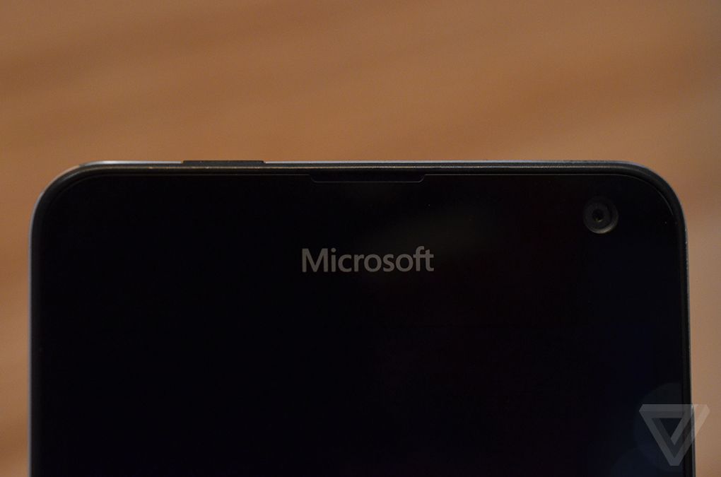
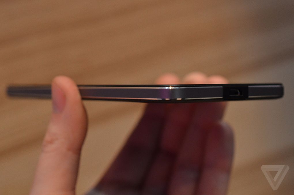
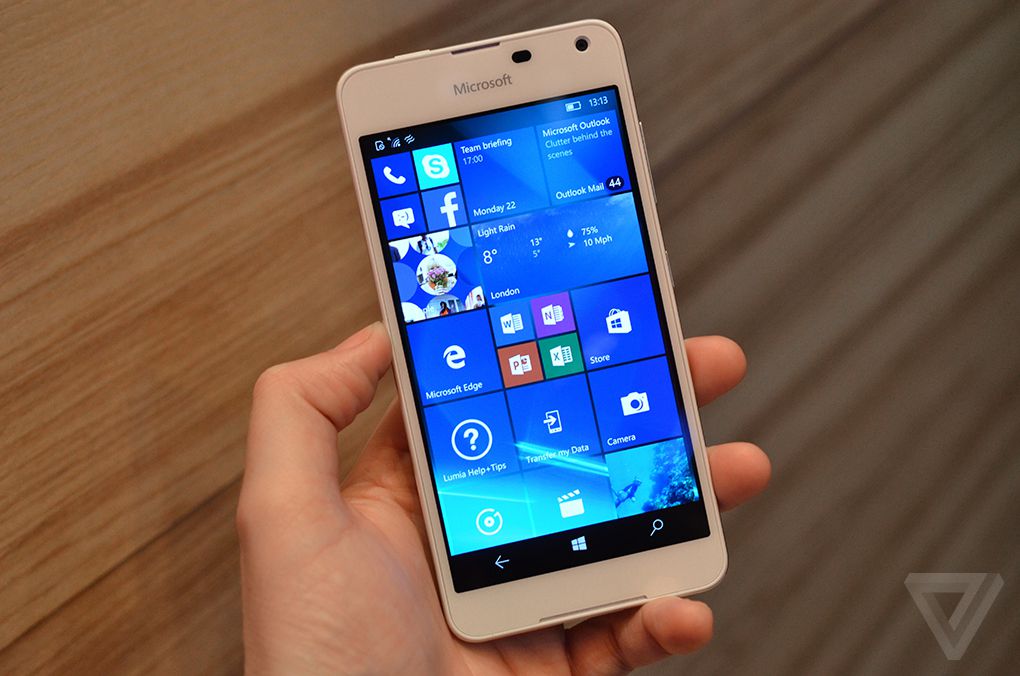
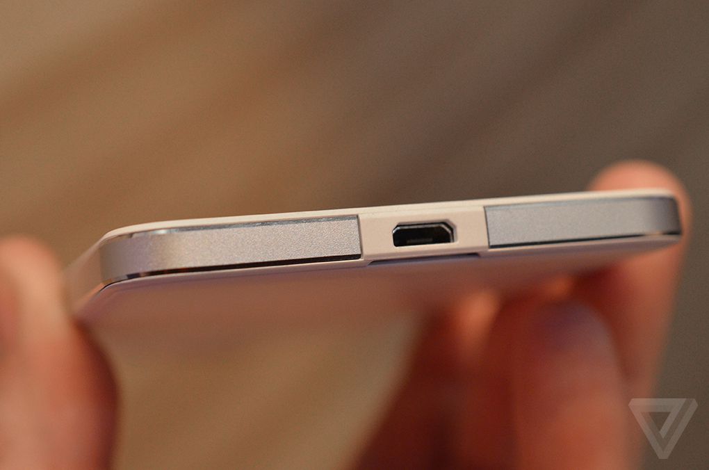
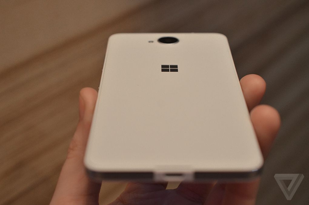
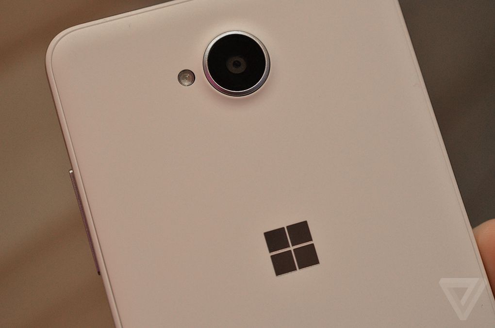
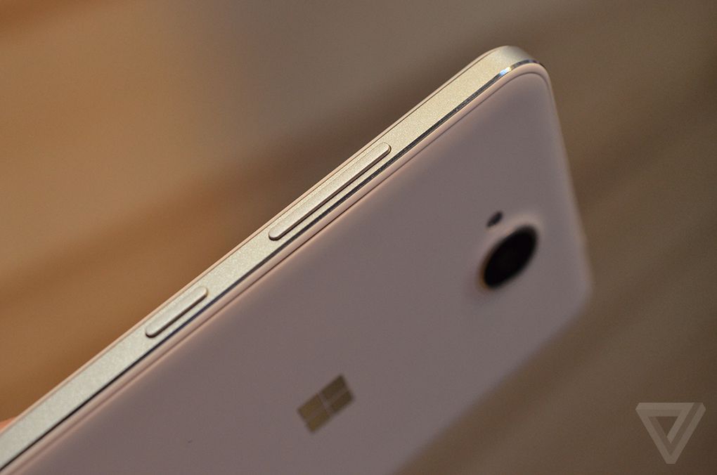
Announced last week, the latest Lumia 650 is designed for businesses and priced at just $199. I got a chance to get a closer look at the Lumia 650 at Mobile World Congress today, and for the price point I’m impressed. It looks and feels so much better than the Lumia 950 that it’s stunning that Microsoft didn’t pick this design for its premium handsets. It still has the familiar Lumia design, but the aluminum frame makes it feel far less plasticky and more comfortable to hold.
It’s also really lightweight at just 122 grams, and a good size thanks to its 5-inch AMOLED display. Unfortunately, it’s still a mid-range device, so it has Qualcomm's underpowered Snapdragon 212 processor inside and just 1GB of RAM. These low specs mean Microsoft’s special Continuum feature (to turn the phone into a PC) isn’t present, so it’s just the regular features of Windows 10 Mobile for the most part.
It’s stunning that Microsoft didn’t pick this design for its premium handsets
If Microsoft could cram flagship features and specifications into a device as lightweight as this then it might give Windows 10 Mobile a better chance. Good Windows phone hardware won’t help address the lack of apps on the platform and ecosystem issues, but at least the hardware wouldn’t be a let down for those eager to use Windows 10 Mobile.
Hint: Use the 's' and 'd' keys to navigate

Comments
Post a Comment